Holts.com Case Study: Improve Checkout Process on Mobile
Responsible for: Research and Design
Research Methods: In-person interviews / Recorded Sessions (Inspectlet)
Design Methods: Persona creation / Customer Journeymaps / Sketching / Wireframing / Prototyping
Programs Used: Sketch / Invision
Research Methods: In-person interviews / Recorded Sessions (Inspectlet)
Design Methods: Persona creation / Customer Journeymaps / Sketching / Wireframing / Prototyping
Programs Used: Sketch / Invision
Current Design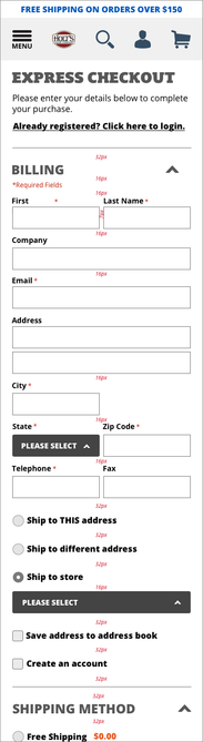
|
STORY:
After launch, I felt that the continuous scroll for the checkout process seemed a bit clunky. To back this up, I talked to a few customers about using the checkout process and witnessed that the customers found the checkout process on Holts.com did NOT reliably work. They struggled to find certain sections to adjust their information during the checkout process. As a test, I asked a handful of customers to pick a product, go to checkout, and adjust their payment form before completing the sale. PROBLEM: Customers found it hard to navigate in checkout process to make adjustments in the continuous scroll design. CHALLENGE:
Current users are finding the 1-page checkout process a bit unclear and cumbersome, especially with making changes to previous accordion sections in the design. |
Why the need?
Business Objective:
- To convert product researchers to paying customers
- Avoid potential sales from happening on competitor’s sites
- To increase online sales and build consumer confidence for the older demographic
User Objective:
- To clearly identify and define the different stages of the checking out process
- To clear up confusion when needing to make changes throughout the checkout process
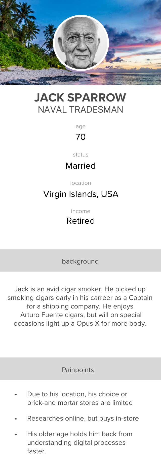
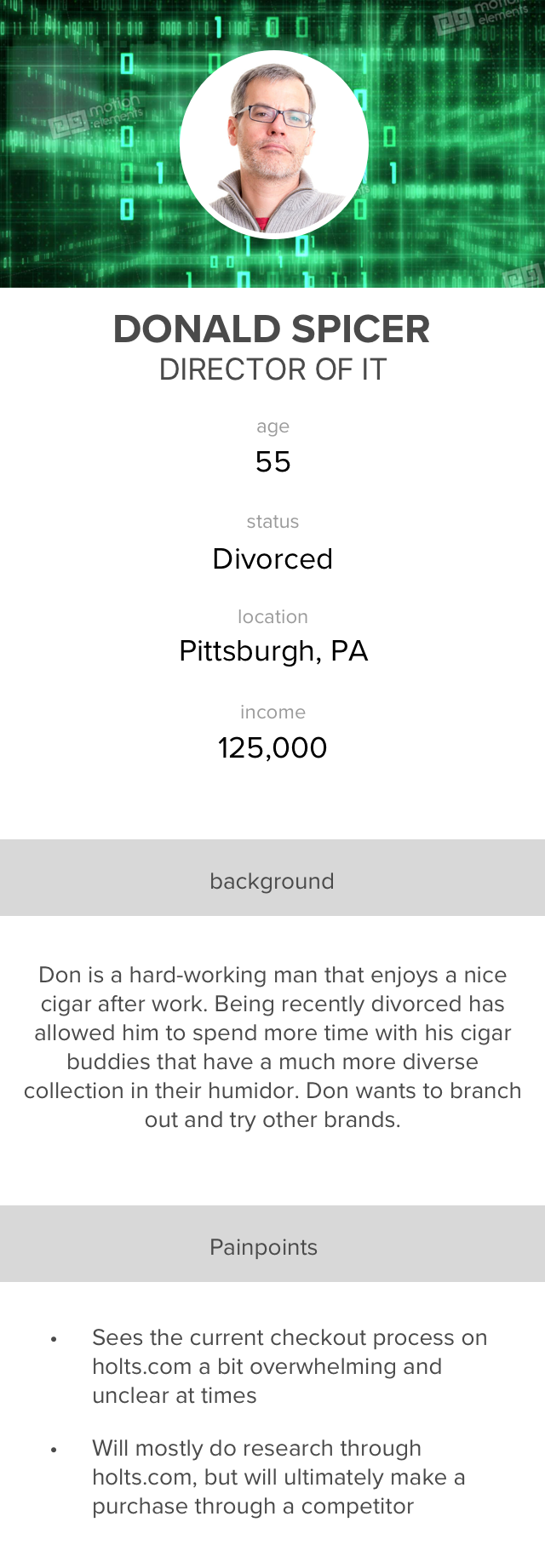
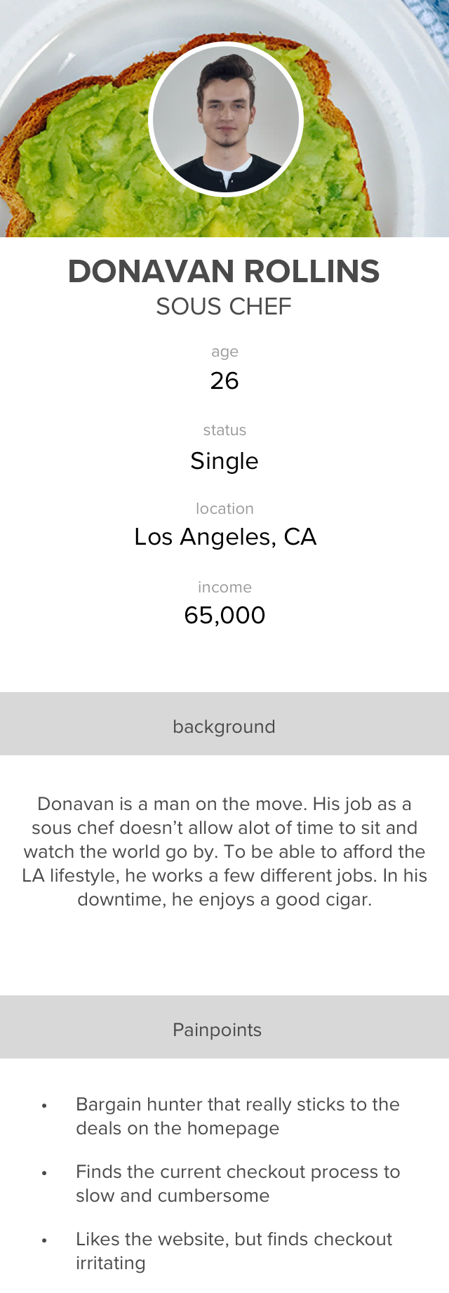
I’ve created some user personas to gain some perspective into the kinds of customers we have based on demographic research of who our users are.
|
|
|
Wireframe sketches for exploratory ideas
Holts.com Case Study: Improve Checkout Process – Design Iteration
1st Step - wireframes
What I learned: Out of the different iterations I came up with, I went with what is shown below. Having clearly defined sections set up as pages within a stepper process was a better experience for our large over-55 demographic.
Step 1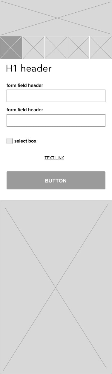
|
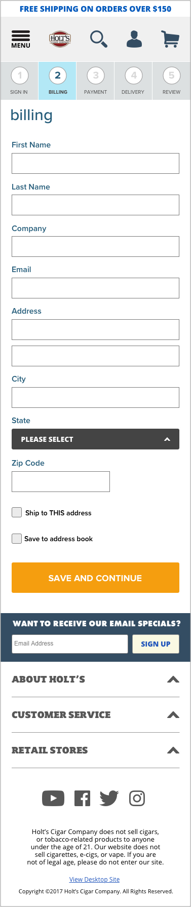
Step 2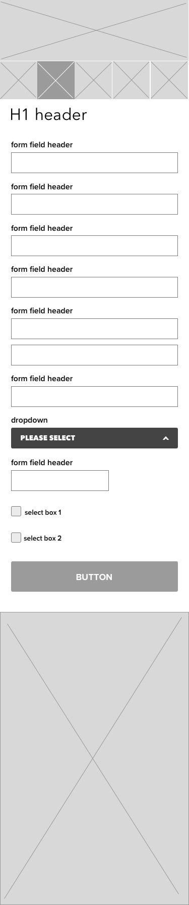
|
Step 3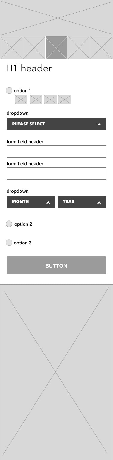
|
Step 4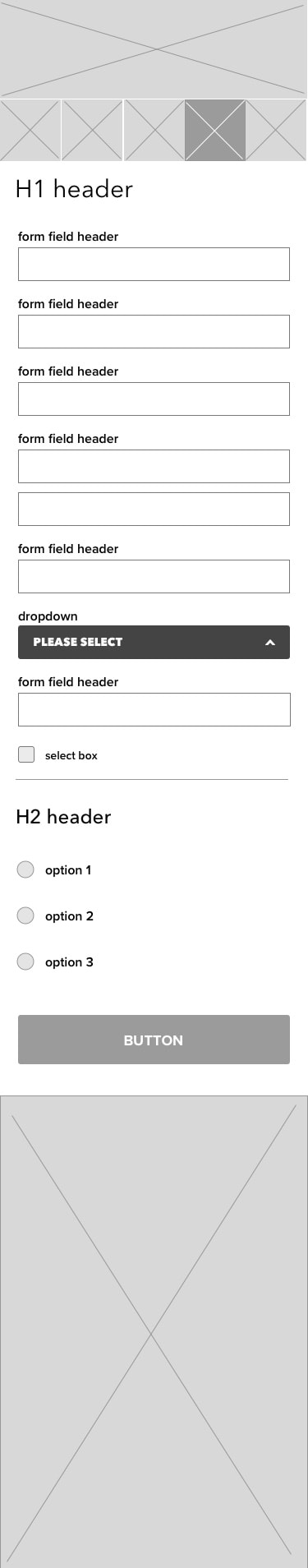
|
Step 5-checkout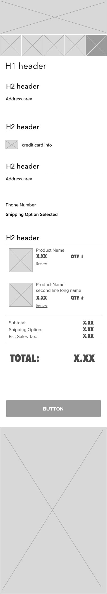
|
Pros and Cons:
|
Pros:
|
Cons:
|
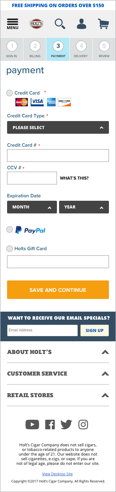
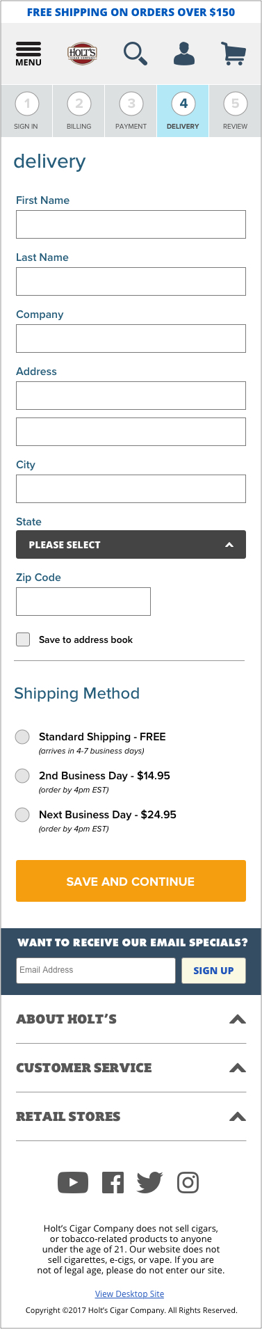
Final Design
What I learned: Showing these final designs to stakeholders and a few customers did allow for less cognitive load when trying to navigate the whole checkout process. Having clear pages/sections allowed for users to stop and understand where they where in the process and also allowed for easier navigation to go back and makes changes.
Step 1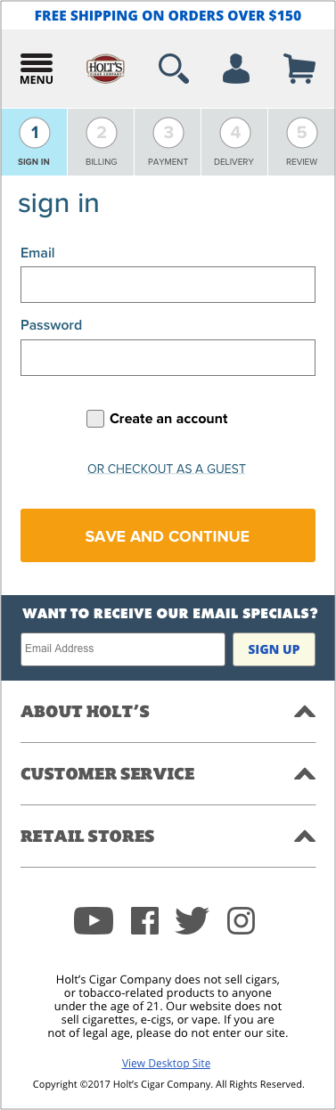
|
|
Step 5-checkout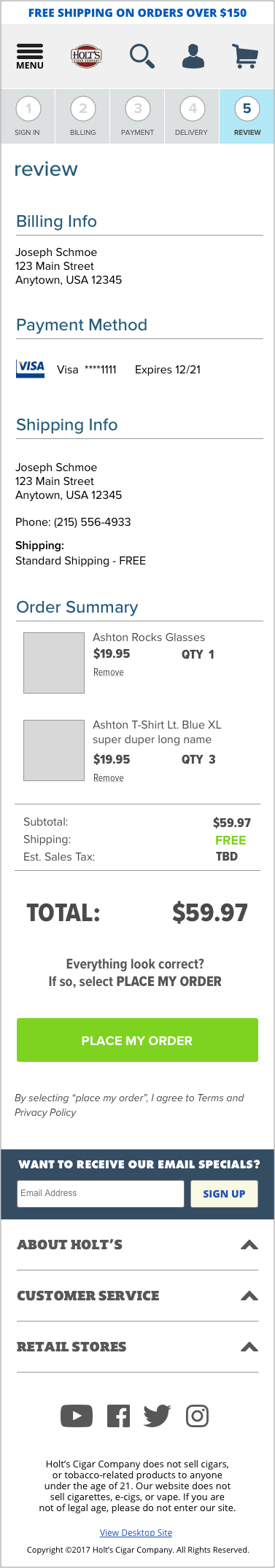
|
Pros and Cons:
|
Pros:
|
Cons:
|
Conclusion
I went back to the same group of regulars in the lounge and presented to them a prototype i created quickly. Judging by their reactions and verbal feedback, this was a definite improvement.
"I really like the option of having the sections easily accessible up to in case i make a mistake or put in the wrong address before i pull the trigger. The less scrolling i have to do to find my way, the better." - John Alexander, Holt's Cigar customer, age 60
"I really like the option of having the sections easily accessible up to in case i make a mistake or put in the wrong address before i pull the trigger. The less scrolling i have to do to find my way, the better." - John Alexander, Holt's Cigar customer, age 60
Overall, this case study was a great opportunity dive deeper into the realm of a user’s experience and I learned a great amount of what it takes to influence a user's decision.