STORY:
This is a SaaS interface that mental and behavioral health therapists, admins, and other mental health professionals use to set up appointments faster with those that need to be seen without long wait times.
PROBLEM: The current interface is out of date and over engineered with poor visuals. This leads to high user frustration, high learning curve, and a long backlog of fixes.
CHALLENGE: Rebuild the entire platform to radically decrease complexitivity and increase user happiness while improving the look of the tool itself. A warmer, more inviting look was requested. A byproduct of this success will also be reduced training times and re-training sessions.
Improve the LMS/CMS interface
Responsible for: Research and Design
Research Methods: Interviews / Past research evaluation
Design Methods: Persona creation / Process Workflows / Sketching / Wireframing / Prototyping
Programs Used: Figma / Usertesting.com platform
Research Methods: Interviews / Past research evaluation
Design Methods: Persona creation / Process Workflows / Sketching / Wireframing / Prototyping
Programs Used: Figma / Usertesting.com platform
NOTE: This was currently still in the design process prior to my layoff. I am only able to show a small portion of the redesign phase.
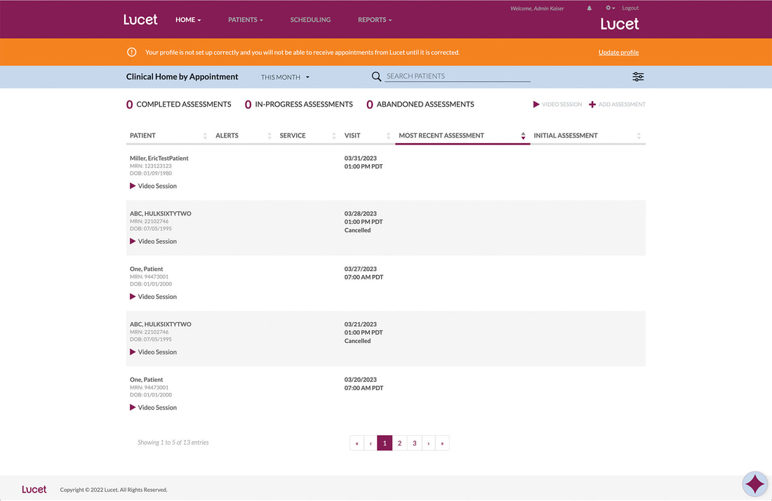
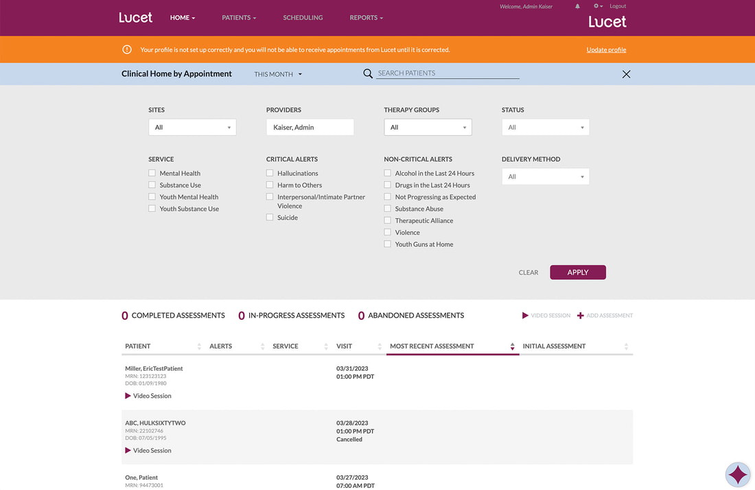
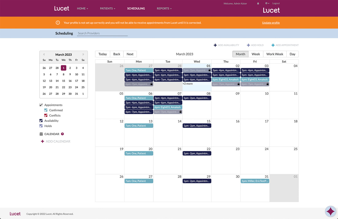
Current Design
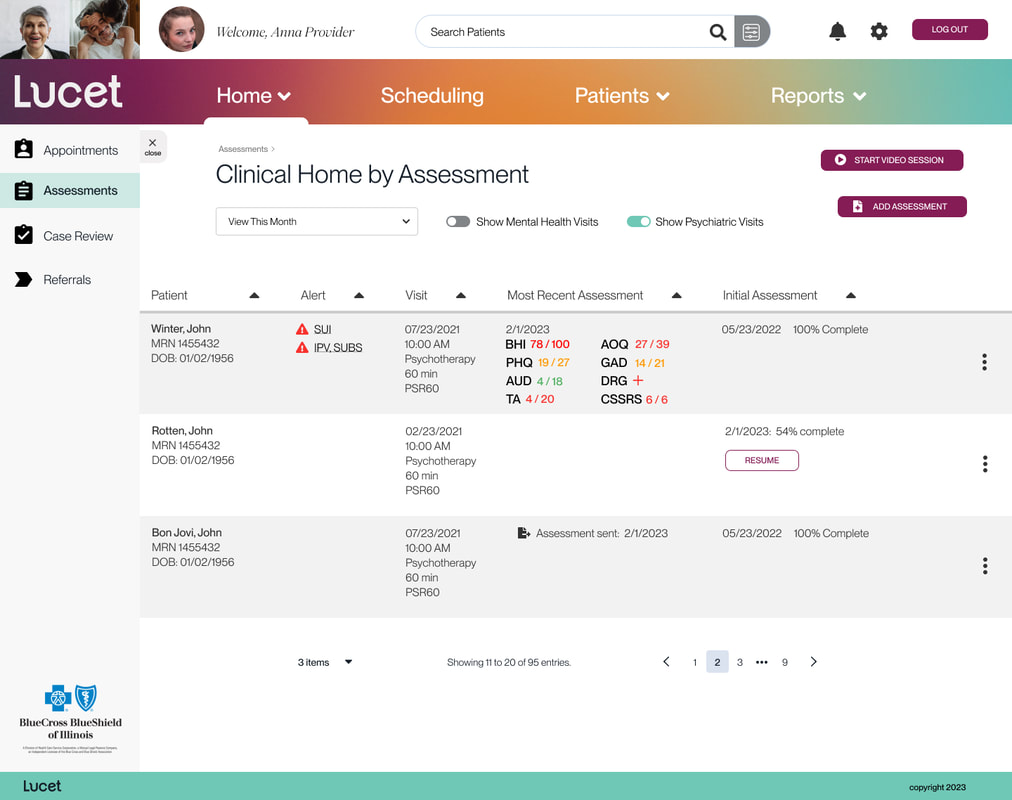
Current Example - Clinical Home by Appointment page
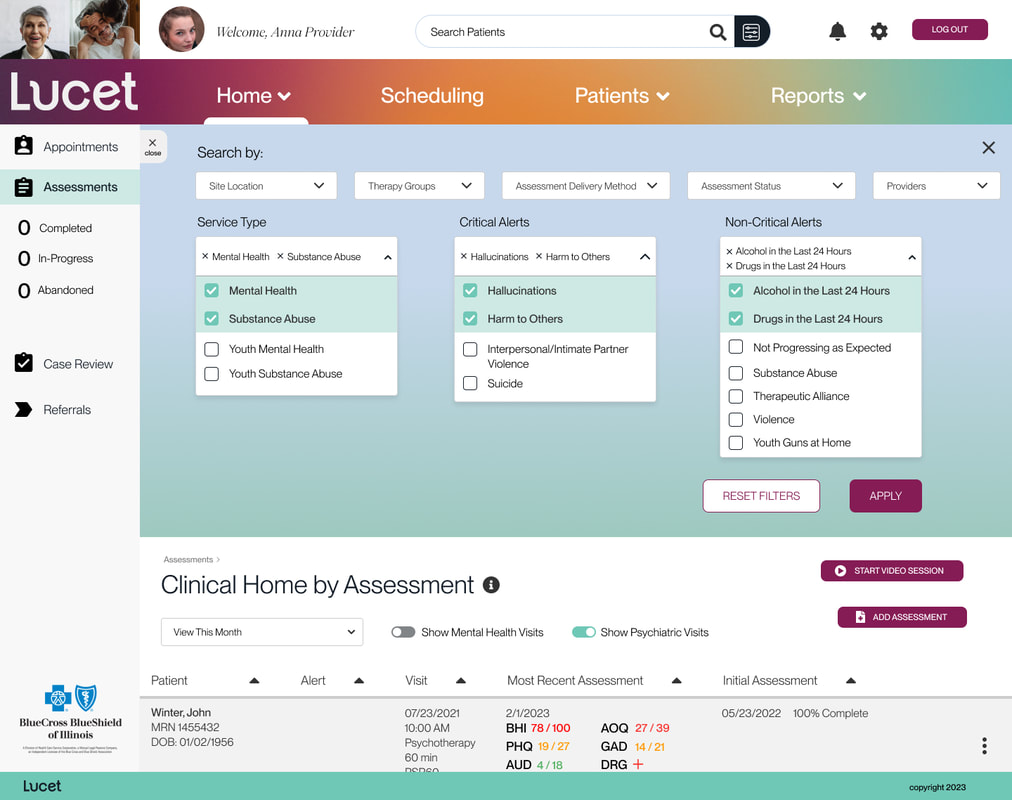
Current Example - Search Filters Open Dropdown
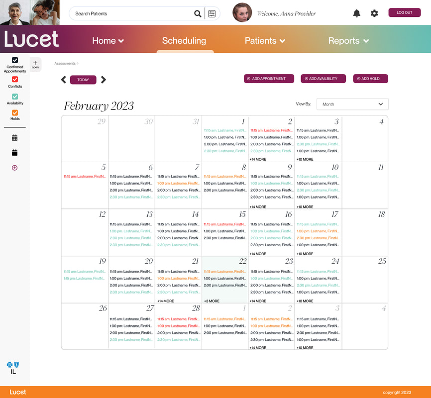
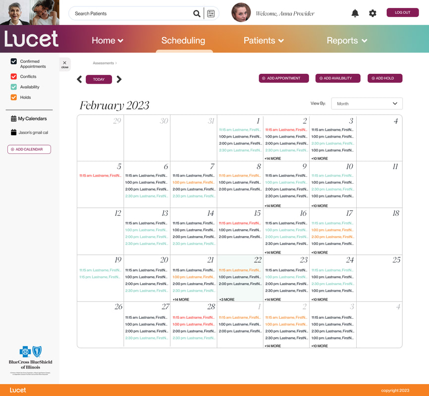
Current Example - Scheduling Calendar page
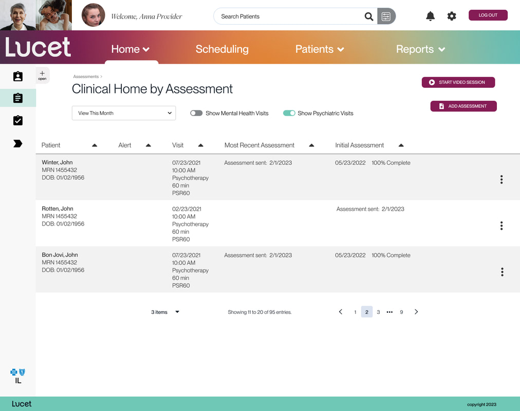
My Designs
What I learned: This project was going to be very involved and had a lot of moving parts. Part of this project was to combine as much as possible to allow for easier maintenance and engineering. I approached this project from the top and worked down through the user's funnel. Working with the product owner, we created a site map and determined what were the main templates that influenced the rest of the platform. What you see below is an example of what we determined were templates.
Revised Homepage with Left Secondary Nav / Left Nav Closed
Revised Homepage with Left Secondary Nav / Left Nav Open
Revised Homepage / Search Filters Dropdown Activated
Scheduling Page / Left Secondary Nav Closed
Scheduling Page / Left Secondary Nav Open
Conclusion
This project was ongoing. The current direction had been very well received by those who have seen what has been done so far.
